Two Data Point Comparison Theatre
There's Often a World of Difference Between Our Expectations and Reality


SUPPOSE I WERE TO GIVE YOU TWO PENCIL CRAYONS: one in red, the other in purple. Suppose further that I tell you that the red pencil crayon is extraordinary, especially in comparison to the purple one, which on reflection was a portent of colors-to-come. In fact, this particular shade of red is the reddest on record.
What could you reasonably infer from this, besides what I’ve led you to believe?
This is an example of a phenomenon I call Two Data Point Comparison Theatre, and it is something we are bombarded with every day in media and business. It tells us that when two adjacent or disparate measurements are compared out-of-context, their differences are always noteworthy, and further that we can predict the future from them.
In our pencil crayon example, we can plainly see the difference between the two we’re given: one is red, the other purple. Further, we’re told that looking back to the purple pencil crayon, we could have easily predicted the next one would be red, and that it would be the reddest on record.
While intentionally absurd, this is what analysis looks like when you suffer from innumeracy and data illiteracy and don’t yet understand how the performance of a system varies over time. Per my Leadership Cheat Code #4:
All systems (and processes) vary by some amount normally, and sometimes, by some amount extraordinarily. Good management depends on knowing how to tell one from the other in order to act accordingly.
In order to make good decisions based on system data, we need to analyze it for variation in the data itself, otherwise we’re deluding ourselves about how the system or process actually works.
Example: Estimated Emigration Statistics
Recently, I came across an article about Statistics Canada’s Q1-2026 emigration figures that superbly demonstrates Two Data Point Comparison Theatrics:
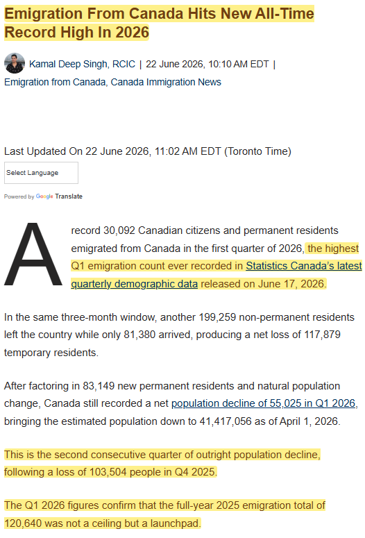
This checks all the boxes for performative analysis:
Headline primes with words like “all-time”, “record”, and “high”
Lede clarifies temporal spread for comparison: “highest Q1 emigration count ever recorded” (the red pencil crayon)
Prior year’s four-quarter TOTAL is characterized as a “launchpad” for the current year. (the purple pencil crayon)
Given what has been revealed so far, what would you reasonably infer from the way the article’s author has presented the data?
Exercise: Draw Your Prediction of the Past
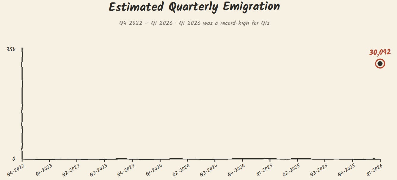
Let’s construct a visual theory based on what we know: get a sheet of paper out and draw two axes on it. On the x-axis, draw 14 regularly-spaced marks and label them from Q4-2022 to Q1-2026. For Q1-2026 place a dot where you think 30k would go given what the article has suggested, maybe like the diagram below — extra marks if you use a red pencil crayon:
Now, draw a curve from the left side of the chart to the right based on how you think it would go to reach Q1-2026, given it is the highest-ever Q1 on record. It might look like the following:
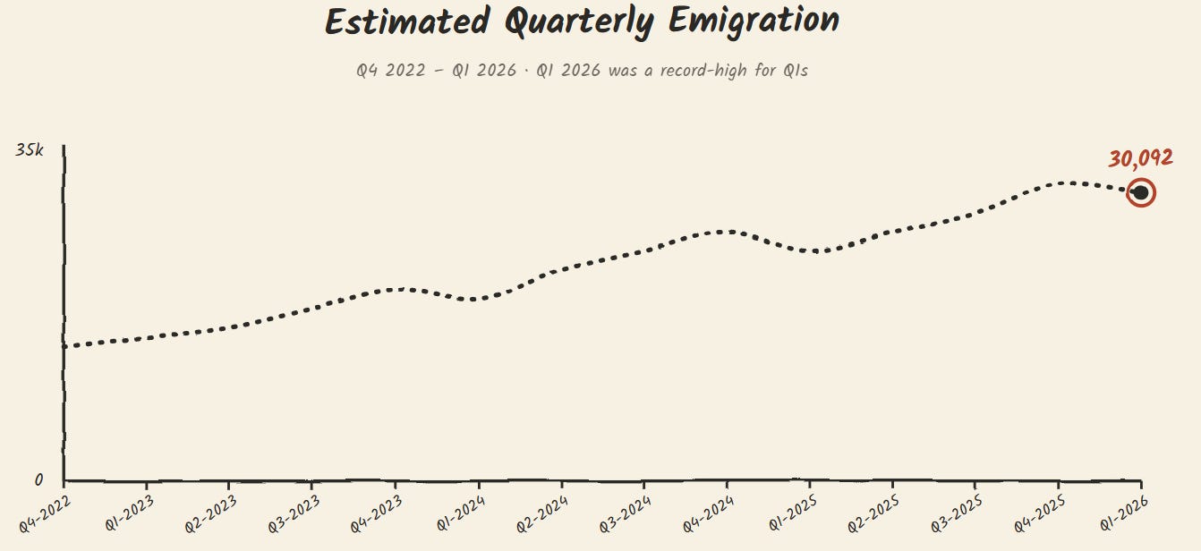
This is our theory for predicting the prior data points from what we’ve been given, ie, the last data point. We are inferring past from present. This isn’t as contrived as you might think: we do this all the time, envisioning a model in our heads that we use to interpret data, especially when given two data points and an ordinal direction.
Let’s pause here and ask ourselves some questions:
As a percentage, how well do you think your model curve represents reality? 0%, 5%, 25%… 50%+ ?
Why did you choose to draw the curve the way you did? What informed it? Did you read something recently that suggested how it could go?
What are the standout features of the curve? Does it undulate regularly or randomly or is it a more or less straight line?
Now, let’s move on to seeing what the omitted/overlooked data tells us…
Comparing to Actuals
If we pull the data for the past 14 quarters from StatsCan and plot in a PBC, we see the following:
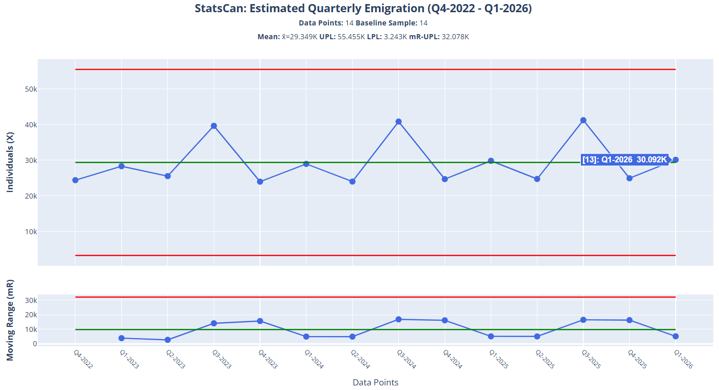
How well does this match with the curve you predicted earlier? When I first ran this analysis, I was surprised as it didn’t match with my expectations at all—but it did reveal something else: this isn’t representative of actual figures as they occurred, but the output of a batch-and-report system. Notice the regular Q3 peaks and Q4-Q1 valleys that tell us the data is being gathered and managed into buckets that always conform to this pattern, at least for the given period. Also observe that while the claim of Q1 2026 being the highest on record may hold, but what about all the Q3s?
Free Tier Subs:
Get the sample data files for running your own analysis at our file repo here to upload into PBC Analyzer PRO. NB: you can only analyze the first 25 data points per series.
Paid Tier Subs:
Get the data files from the repo as above and upload directly into PBC Analyzer PRO, or use the statscan-to-pbc Claude Skill I introduced in an earlier newsletter to pull the data and plot as a PBC.
Already we have an interesting question to ask: Does this pattern persist if we go further back? Let’s zoom out and look at the big picture over 17 years from Q1-2010 to Q1-2026:
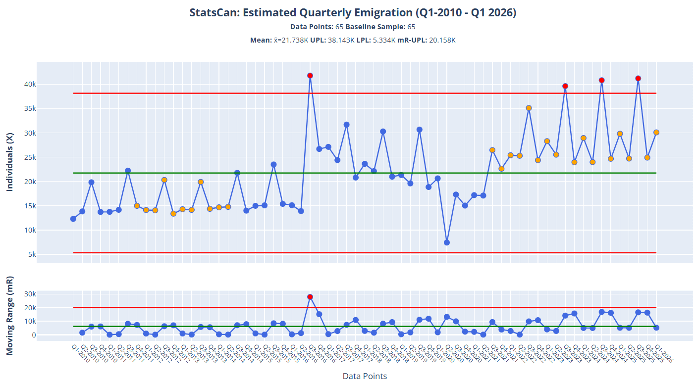
What do you notice about the shape of curves in this chart? Here’s what I see:
Three distinct periods of regularly-shaped variation with Rule 2 (orange) and Rule 1 (red) signals on both the individuals and moving range charts.
The rightmost Rule 2/1 datapoints are all above the mean (operational definition of Rule 2 signals) which means there’s more input going into the routine batch-and-report system. It’s also showing mini Q1 peaks in-between the Q3 peaks, which is different from the muted pattern shown on the left side of the chart.
With some exceptions, the moving range chart also exhibits a pattern of regular, undulating variation — with a few exceptions.
Using PBC Analyzer PRO’s new Divide feature (shortcut V), we can separate the chart into discrete periods with their own limits:
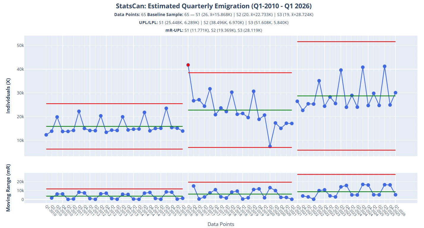
Now what do we observe?
Each period presents increasing variation as evidenced by the expanding process limits on both the individuals and moving range charts, with the last period exhibiting the widest range of variation.
Each period’s mean is higher than the prior period(s).
Only one Rule 1 signal is shown, for Q3 2016.
The pattern of variation in the moving range chart has some similarities across the periods, despite the shape of the individuals data being different.
What this tells us is that the reporting system has gone through changes, not only in volume of inputs, but in how they were managed and reported, especially between Q3-2016 and Q3-2021. None of this was considered in the article which sensationalized comparing two data points out of context, yet is critical for making an informed opinion about the figures we’re presented.
So, given the red and purple pencil crayons the article gave us to work with, consider what questions this analysis raises for you. What would you want to know? How reliable do you consider the quarterly statistics to be? Why?
Summary
This post set out a cautionary tale about one of the most common malpractices in data analysis: Two Data Point Comparison Theatre, the phenomenon that occurs when we lead our users to draw a conclusion based on the comparison between two data points taken out of context. We framed this as an exercise of extrapolating insight from two pencil crayons, one red, one purple, with the red being predictable from the purple — even though we had scant evidence to support the claim. Similarly, our case study came from an article about Canada’s latest quarterly emigration stats for Q1, which were apparently the highest Q1 figures on record, with no prior data analysis or figures provided: it was all a naive comparison of isolated figures.
We then tested our expectations of what we thought the data would look like by drawing a curve based on the last data point and the claims made in the article, then comparing it against the actuals and discovered we weren’t even in the same zip-code. Where we might have thought the data moved lazily along plateaus with ever-increasing Q1 figures, in reality there is a highly-managed system that is packaging and reporting figures with large releases every third quarter. Further, we discovered that not only was the volume of emigration increasing, but so were the swings in variation, leaving us questioning the “reality” of the figures we’re getting each quarter: how much was attributable to the system doing the reporting?
Moral of the story: when analyzing data, avoid getting the cheap seats at the Two Data Point Theatre.
What Do You Think?
Try the exercise and analysis with your colleagues and friends. What kinds of curves are drawn? What is the prediction for how accurate they believe them to be? Now do the PBC analysis — what’s the reaction? Now do the same exercise for a process you work under (provided you can get the actuals to compare against).
What differences did you observe? What informed your theory? What does the data suggest? How could knowing recent historical data on the system or process help make higher quality decisions? What would it contribute to improving for the customer? Why?
As always, let me know your thoughts in the comments below…