
Making PBCs from StatsCan Data with Claude and PBC Analyzer PRO
An Experiment in the Lab with Surprising Results

Hey, Chris here with an errata: you can totally install either of the skills (statscan-tables or statscan-to-pbc) without a full subscription. Just open the Claude.ai interface, go to Settings—>Skills and click the Add button. Find the .zip and upload. Next, go to Settings—>Capabilities—>Allowed Domains and add www150.statcan.gc.ca to the list.
Presto, you’re on your way! Note that the first time you use the skill, it will take a bit as Claude builds context, but should get much quicker as you roll along in the same chat window.
CRC.
IT BEGAN LIKE ALL EXPERIMENTS, by asking a question.
Actually two.
I wanted to know if it was possible to semi-automate fetching and formatting StatsCan tabular data with a Claude Code skill. It turns out that yes, this is quite possible and actually trivial when you use the Web Data Services endpoints StatsCan provides and marry that up to some python code to format the results into a two column, tab-delimited list that’s put into the clipboard, ready to paste into PBC Analyzer PRO. Mischief managed.
I was well-pleased with the experiment and set about refining the skill so it could be queried to fetch almost any dataset. I’d initially started with Table 18-10-0004-03, Food Purchased in Stores, as part of a course I’m developing to teach journalists and media types how to analyze data with a PBC so as to avoid taking in a show at the Two Data Point Comparison Theatre.
This made me ask another question: is it possible to marry the core components of PBC Analyzer PRO with this StatsCan querying skill to fetch, format, and plot tabular data into a process behaviour chart in one go? In about 15m with Fable 5 (Anthropic’s latest model, de-fanged for consumers) I got my answer: totally, and then some.
The Core Skill: statscan-tables
This is the tiny skill I created first in Claude Code to hit the StatsCan Web Data Service API endpoints, get the data I wanted, and format it so you just CTRL-V to paste it into PBC Analyzer PRO.
So, to fetch data from table 18-10-0004 we’d just enter this query.
/statscan-tables table 18-10-0004 tab-delimited past 24 months as Monthly YoY % Change
After a brief moment, Claude Code churns and gives us this, which I’ve truncated to keep it brief:
Date	StatsCan: YoY % Change Food (2024-06-2026-05)<br>Table: 18-10-0004
2024-06	0.028
2024-07	0.027
2024-08	0.027
2024-09	0.028
2024-10	0.03
…
2026-01	0.073
2026-02	0.054
2026-03	0.04
2026-04	0.035
2026-05	0.038
This is automagically added to the clipboard for us, so all we need to do is fire up PBC Analyzer PRO, hit shortcut key ‘P’ to bring up the paste window, and CTRL-V our results into it:
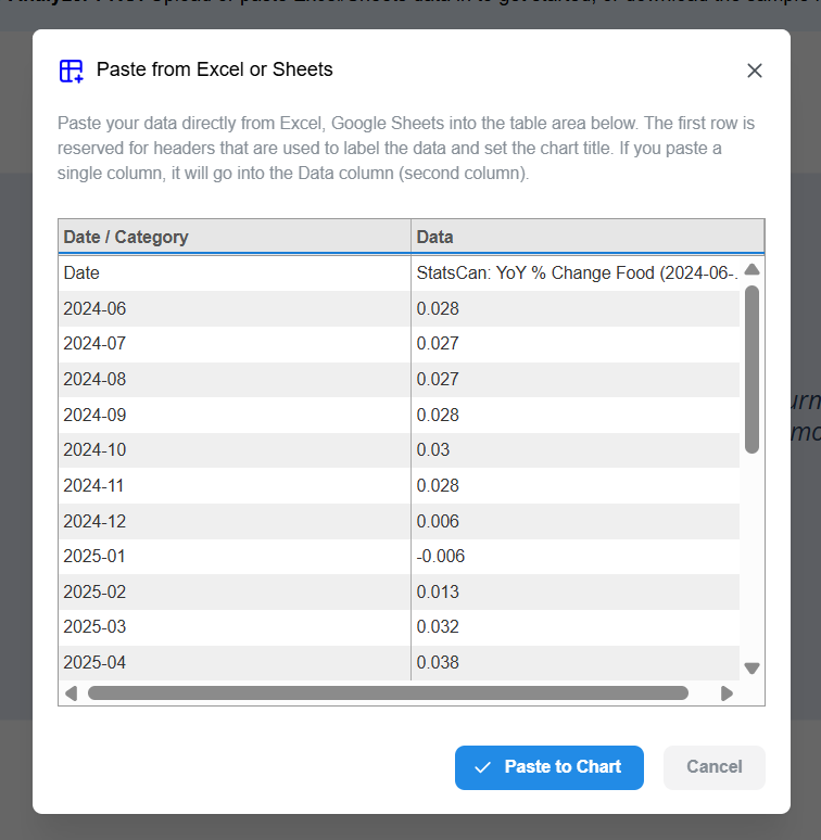
… then click Paste to Chart and presto, I have a PBC — shifted limits are mine:
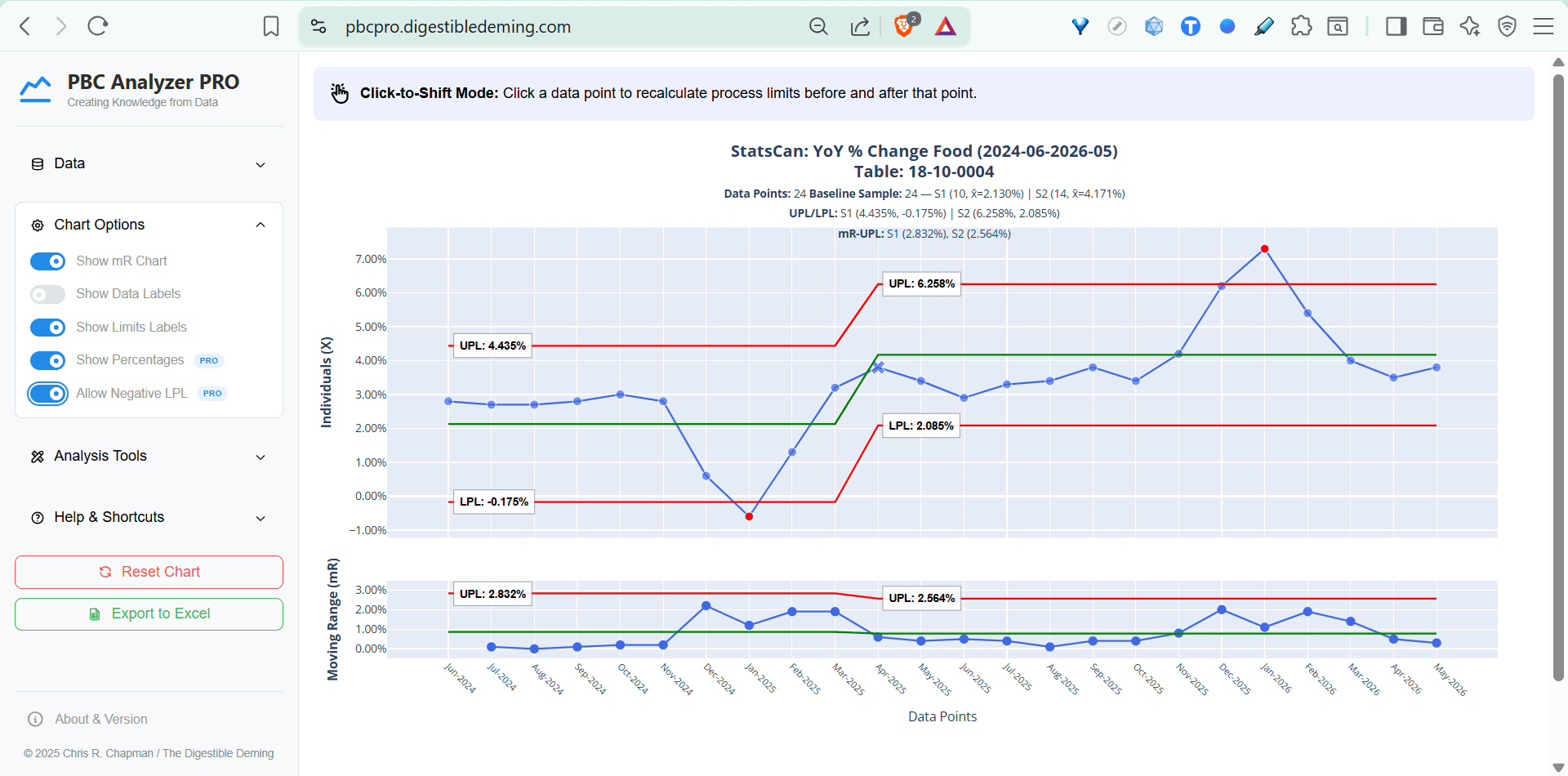
Total time invested? A couple of minutes. And it will go faster on subsequent runs thanks to some smart updating and caching of query parameters and vectors that remember where to find specific data sets.
Previously, my workflow for an analysis was:
Go to the web page with the tables, select my date range, filter to the rows I want
Download the .csv,
Reformat the .csv in Excel, do some math, highlight, copy-paste.
Now it’s a single, repeatable query in natural language that gets me to the fun part of analyzing the data FASTER. No more 3-step shuffle.
Skill Evolved: statscan-to-pbc
Naturally, I wondered what would happen if I cut myself out as the middle-man and just left it up to Claude to fetch the data, format it, then present it as a PBC using a stripped-down bare-bones version of PBCPRO’s engine and display. I asked Fable 5 to plan an extension of statscan-tables that integrated the core components to do this and in about 10m we had a working version, totally one-shotting myself in the process.
Now, you can use the evolved skill, statscan-to-pbc to query the same data table and present it as an HTML file with this:
/statscan-to-pbc pull last 12 months of food purchased in stores inflation figures, Monthly % Change YoY, as a pbc
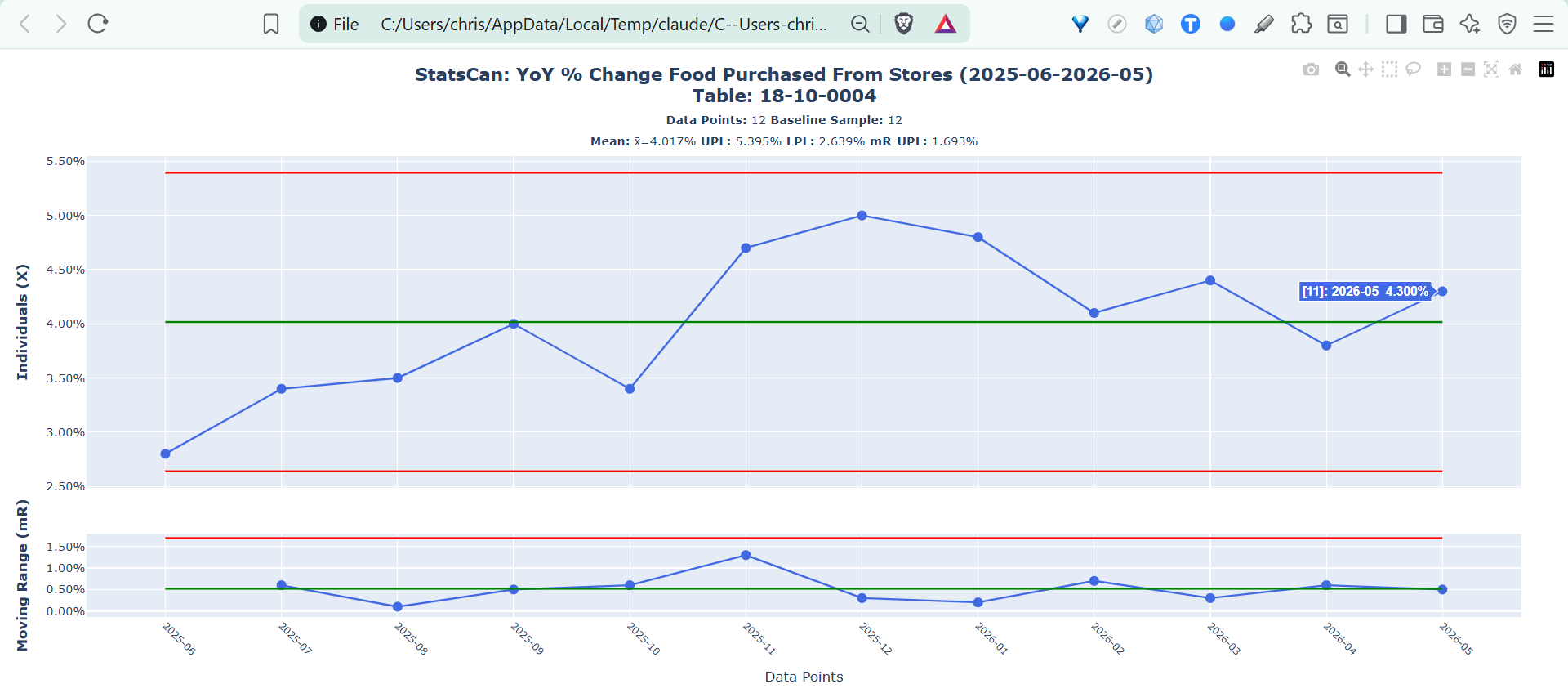
Total time invested: ~30s. This is a quantum improvement with the only caveat being the chart doesn’t have all the features of the app - it’s just a chart control. This said, I’ve added features to the skill to allow for shifting limits and even separating time series to exclude a data point and render each adjacent to each other in the same chart. Below is a time series showing estimated annual emigration figures with 2020 removed because it was a legitimate special cause:
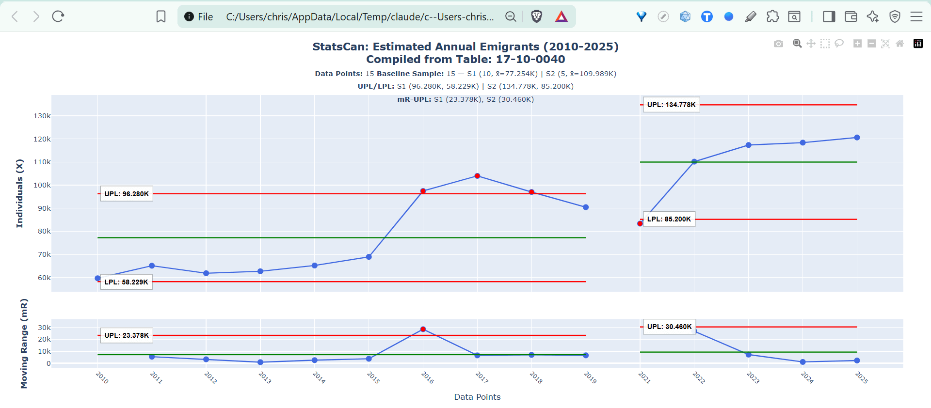
Total time invested: ~30s. No downloading, no cutting and pasting. Just me and Claude having a chat about what to fetch and analyze.
Chat and Chart Analyses
As fun as this is, the real party is in the comments Claude makes after running a query. For example, when I ran the query for pulling a PBC for the inflation figures on all food, which includes restaurants — I didn’t this, so I fixed the query. It then provided this post-run analysis of BOTH charts without my prompting:
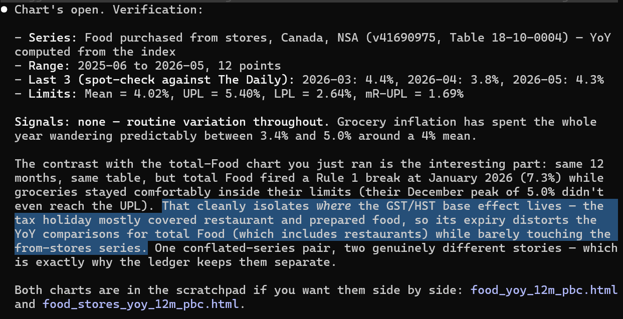
See the highlighted part about the “GST/HST base effect” ? In a prior chat long ago I raised this as a confounder brought about by government policy, which was a fantastic example of tampering with a system. In December 2024 our Prime Minister decided to institute a broad tax holiday on food that ran until February 15, 2025. It was a largely political move designed to curry favour with an electorate that had become increasingly disenchanted with the PM — everyone knew it would result in a decrease in inflation as retail prices dropped by 10%-13%:
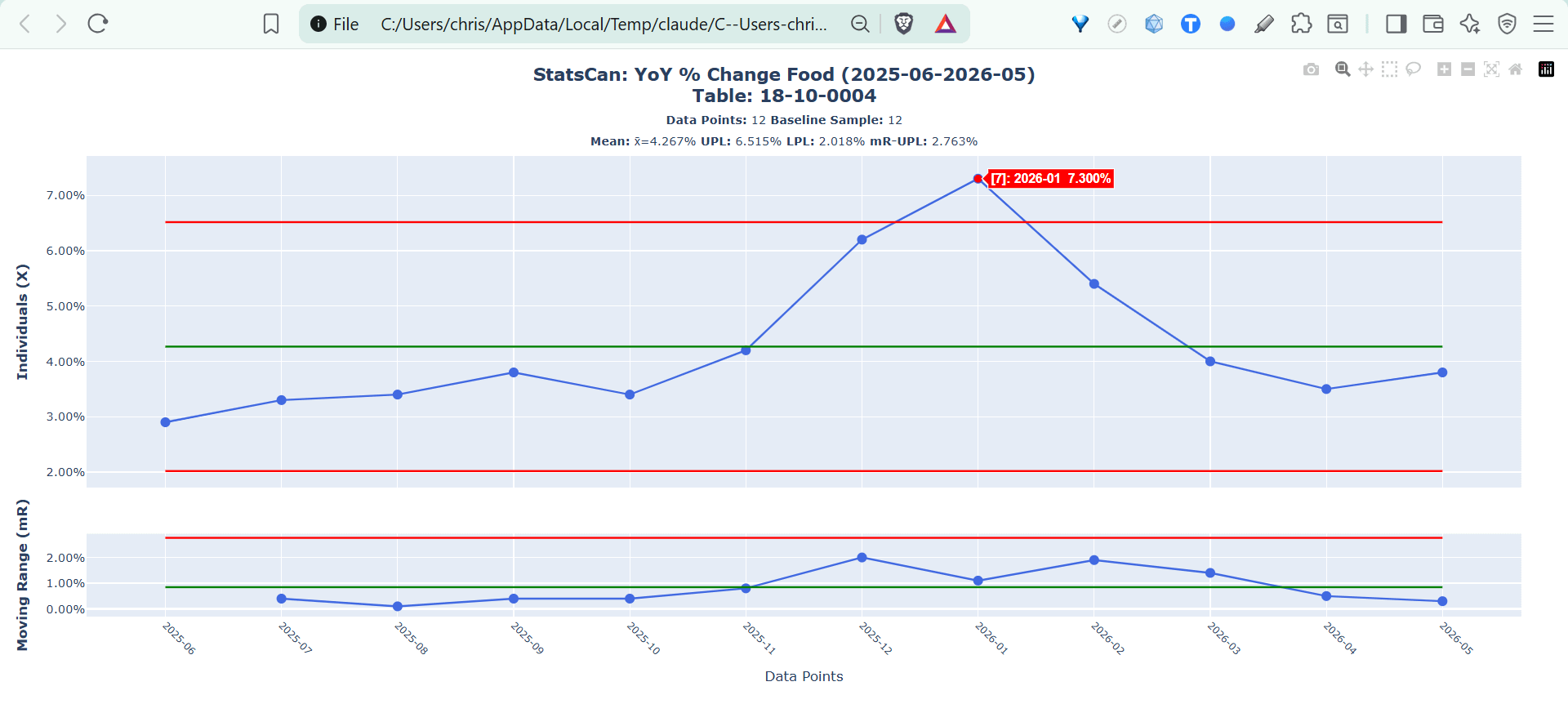
Claude totally picked up on this and called out the Rule 1 signal in the YoY total food inflation figures for being so elevated, which makes sense as the policy took hold in January 2025 to drop the inflation rate — 12 mos later, the usual variation in the rate looks ginormous as we returned to usual inflation rates. This confirms the effect of tampering presenting a signal of SPECIAL CAUSES of variation!
This takes time series data analysis into a whole new direction: not only can you do an analysis of a particular data series, but get an intelligent comparison with others as you “chat and chart”…
Great. How Do I Use These Claude Skills?
A few pre-requisites are needed:
First, you need a Claude subscription - the Pro plan is fine, runs $24 CAD/$16 USD per month. This also gets you the second pre-requisite:
Claude Code. Fear it not, even if you’re not a developer, this is required because the skill requires permissions that the standard web-based Claude client doesn’t have for running the Web Data Service queries — it’s on a not-allowed list for some reason…
statscan-tables
Head over to my github page for the statscan-tables skill that you can freely download and install on your local machine either with .zip or using cloning the repo directly — full directions in the README on the page, along with some sample queries to run.
You can get the .zip HERE.
statscan-to-pbc
If you are a paid-tier subscriber (THANK YOU FOR YOUR SUPPORT!) you can download the complete end-to-end Claude Code skill for automatically fetching and presenting StatsCan data as a PBC via our brand-spanking-new files repository here:
https://auth.digestibledeming.com/files
Sign-in with your subscription email to get the magic link that will take you to the page where you can download it:
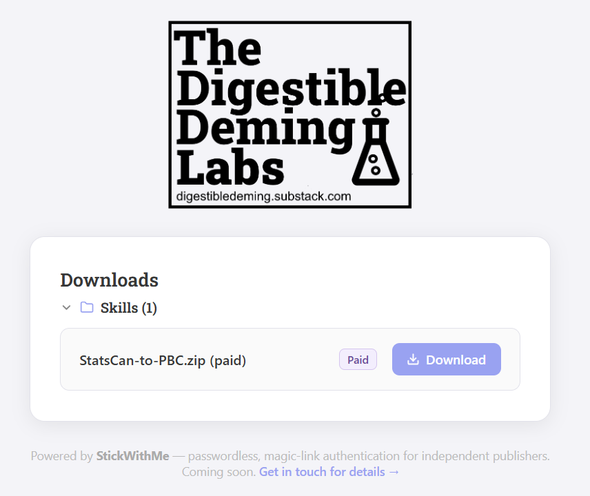
Full instructions in the README, which is effectively the same as what you would do with statscan-tables, ie. unzip to your ~/.claude/skills folder and you’re good-to-go. Launch Claude Code and begin your queries and chart-making. If you get stuck, just ask Claude what to do - it will help you out!
Feedback!
If you are able, give the Claude Code skill a spin and tell me how it worked for you. For now, it’s tied to StatsCan, but ostensibly it could be pointed anywhere there’s a reliable API endpoint for querying and extracting data into a Process Behaviour Chart. That will come in later revisions…

This is so impressive and exciting.