


Mini PBC Analysis: Canadian Food Inflation
Some Practice to Keep the Skills Sharp

THE AIM for this quick post is to provide an example of how you can use Process Behaviour Charts to analyze everyday data to get better insights than is typically on-offer from the media, in this case on the change in Canada’s Monthly Food Inflation Rate as published by Statistics Canada this morning. While this isn’t the typical PBC application, it does provide an opportunity to practice our insight-generation skills.
For today’s analysis, I’ll be showing PBCs generated by my educational tool, PBC Analyzer PRO, which comes in two flavours: Full for paid-tier subscribers, and Free for those who just want to experiment with some sample data sets.
Recall: The Purpose of a Process Behaviour Chart
For the benefit of new subscribers who may be unfamiliar, a Process Behaviour Chart or PBC is a visual tool that we use to evaluate the homogeneity or “sameness” of time-series data and separate out signals that we can investigate for causes.
It does this by adding some critical guides to a typical run-chart called process limits which help to visually isolate normal or routinely-variating data points from those that do not. These guides are not arbitratry: they are calculated from the successive differences between pairs of data points called the moving range or mR. For a deeper dive, see my earlier newsletters here and here.
We generally use three rules to identify signals on a PBC, in descending order of strength:
Rule #1: Any data points outside the red process limit lines;
Rule #2: Eight or more consecutive data points travelling above or below the green mean line;
Rule #3: Three out of four consecutive points that are closer to a red process limit line than they are to the mean.
Depending on the variation in the data, any or all of these signals could be present — or none at all. When there are no signals, we say the data represents a stable and predictable process or system, and unstable when there are.
Case Study Context: Canada Food Inflation Rate
Each month Canada’s national statistics body, Statistics Canada, publishes a host of indicators and metrics about how our economy is working. They are effectively a census of operations and for our purposes are examples of an enumerative study, ie. summary statistics that tell us how many or how much of something has accrued or depleted, but not why.
Typically, this data is presented sensationally in the media, usually in the form of some metric or indicator has increased or surged or decreased or fallen since the last month’s report. This limited comparison is what I call two-data-point comparison theatre, because it tells us very little about why we should be concerned about a change by eliminating all the data that came before it.
Take for example these posts on X by Sylvain Charlebois, a food economics professor from Dalhousie University, someone whom I have great respect for the work he does, but not necessarily for the way he presents data:


So, points to the professor for visualizing the data in the first post with a bar graph because we humans process that much more quickly than looking for discrepancies in figures, and also for indicating a potential special cause of variation in December when the government suspended the federal sales tax on grocery items, this gives us a clue about why one bar is shorter than the others. Note as well in the second post the appeal to compare the current data point with one in the distant past, absent context. This is all dramatic fun, but in the end just two-data-point comparison theatre.
We can do a lot better if we plot these same data points on a Process Behaviour Chart.
Plot the Dots
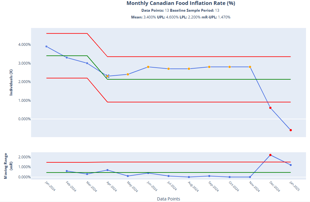
Below is the same data the professor used but rendered as a PBC using my tool, PBC Analyzer PRO. This is typically how I start any analysis, by looking at the whole data series and using all the variation between the datapoints to calculate the mean and process limits:

Some key observations:
The majority of data points on the Individuals (X) chart vary around a mean of 2.42%.
The red dots are Rule #1 signals, the strongest indicators of dissimilarity and special causes of variation in the inflation rate data.
The red dot on the lower Moving Range chart tells us that the change in the rate from November 2024 to December 2024 is outside the norms established over prior months.
In other words, we have confirmed signals in the data: this is an unstable system.
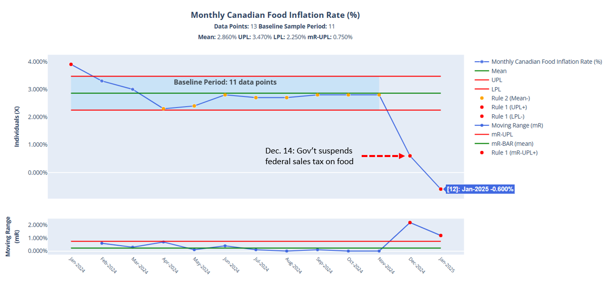
Testing Data with a Baseline
The next thing I like to do in a PBC analysis is set a baseline period for calculating the mean and process limits to test a hypothesis or change. In this case I have a good hunch that a change occurred in December 2014 when the federal government suspended the GST on groceries, so I’ll set a baseline from January to November:
If you pause the video around the 7s mark you can see the effect the baseline has on narrowing the process limits around a new mean (2.86%) which pushes the first and last two data points further outside their reach. Also, note there are now two signals in the Moving Range (mR) chart, indicating that the two consecutive drops are well-outside the normal range of variation established by the prior 11 data points.
But, what about those orange dots? What do they mean? These are Rule #2 signals, where we have an aggregation of eight or more data points below the mean. These usually presage a change in the system, typically in favour of the side of the mean they fall on; in this case, the variation suggests a gradual decrease to a new period of stability. Would this have happened? We can test this by re-calculating the limits starting in April 2024 to break the PBC into two segments. This is called "shifting the limits”:
In this view, we can see the eight Rule #2 signals are now above a new mean (2.13%), suggesting that future data points could have either stayed constant or increased. Regardless, the intervention in December still brings the last two data points below the lower process limits. It’s another confirmation of special causes, just from a different perspective.
With this knowledge in-hand, we have a better story to tell about what happened to the food inflation rate and possibly establish the suspension of the GST/HST as a cause for its rapid decrese. Our revised chart might look like this:

We could infer, from the data provided that there is a potential causal linkage between cutting sales taxes and the food inflation rate. However, this analysis needs to run for a while to see whether that holds. Why?
Empirical Evidence is NEVER Complete
Something to bear in mind when using PBCs to analyze data is that you are only dipping into a stream for a specific period of time: the limits are only as useful as the time series they contain. There’s always more data to gather over time that will test those limits and the predictability of the system. And so it is with this data, which will have another special cause to track after the federal sales tax was re-applied on February 15th.
We can make a prediction that the inflation rate will increase, but we’ll need to wait to add that data to the chart to confirm one way or another.
Concluding Thoughts
My aim here has been to demonstrate how to use a Process Behaviour Chart to analyze some everyday statistical data for signals of significant dissimilarity, or special causes that we could use to evaluate a policy change, in this case the effect suspension of federal sales taxes on food inflation rates as measured by Statistics Canada. Through the exercise, we learned how the PBC makes identifying signals in data easy and the subsequent analysis deeper than just a commentary on the difference of one data point over another: we can now affirm causes for change.
Despite this example analysis being rather simple and re-confirming of obvious changes in the data as the Professor Charlebois showed in his bar chart, it’s not always so evident. This is why it’s good to practice the skill of analyzing all kinds of data to see what its “voice” is trying to communicate.
I do this kind of analysis on data all the time, not just on systems or processes that I’m helping customers improve for quality: it is a driving factor behind why I created my tool PBC Analyzer PRO, to make creating PBCs easy for anyone to do on any time series data to build their own knowledge.
Consider: How could you use PBCs in your organization to test the effects of policy changes? What would thinking about common and special causes of variation change in how you or your senior leadership manage?
Let me know in the comments below.

Nice analysis.
I think the hypothesis proven by the data goes something like this:
"lower taxes = lower prices"
Who knew?!