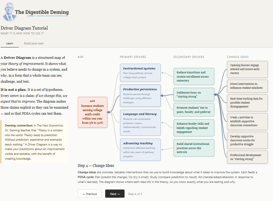
Tutorial: The Driver Diagram
How to Visualize your Theory of Improvement as a System


The first step in any organization is to draw a flow diagram to show how each component depends on others. Then everyone may understand what his job is. If people do not see the process, they can not improve prove it. Anyone needs to see the process as a catwalk, a flow diagram-Paul Batalden, M.D., 13 November 1990.
W. Edwards Deming. The New Economics for Industry, Government, Education (Kindle Locations 287-289). Kindle Edition.
Joy in work. Suppose that we post names on Figure 6: you work here; John works there; I work here. Then everybody body may see straightaway what his job is-whom do I depend on, who depends on me. Anyone may now understand stand how his work fits in with the work of other people. He may now engage his mind as well as his labor. He understands now what is meant by doing a good job. He may now take joy in his work.
W. Edwards Deming. The New Economics for Industry, Government, Education (Kindle Locations 513-516). Kindle Edition.
THE AIM for this post is to share a technique I picked up for seeing proposed system improvements as a network of hypotheses called a Driver Diagram. I learned about it from the book that inspired my latest podcast guest, John Dues, on his journey toward improving schools with a Deming view, Learning to Improve: How America’s Schools Can Get Better at Getting Better, and I think it’s a fantastic way to learn about how to lead with a systems view while planning actionable improvements.
Below, I’ll explain what a Driver Diagram is and how it is constructed, leveraging the example the authors provide in the book. Let’s begin…
What is a Driver Diagram?
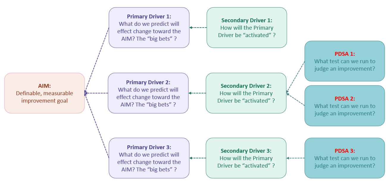
At its simplest, a map of proposed improvements and changes to a system and the expected outcomes they will contribute to realizing.
It’s comprised of four key elements.
The Improvement AIM: a definable and measurable goal for the proposed change.
The Primary Drivers: The hypotheses about the main areas of influence that will effect the change in the system, the “big bets”, or the “what”.
Selected Secondary Drivers: Specific system components that are predicted to “activate” the Primary Drivers, ie. the “how”.
Supporting Change Ideas: PDSA experiments to test changes in processes, tools, etc. to see if they result in an improvement.
1. Start with the AIM
As with anything to do with systems, you need to first begin by understanding the AIM for a proposed improvement with a clear and measurable outcome. In effect, an operational definition for the change. Don’t skimp on this step: bring people together, share ideas for what your goal is, whether you think it’s within the capability of everyone involved, and the methods and means you’ll use to evaluate success, including how long the changes will need to run and who will be impacted.
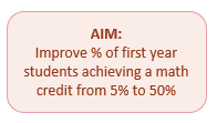
In the book, the authors illustrate a goal of increasing the number of students who achieve a college math credit in their first year from 5% of cohort to 50% of cohort. Other examples could be:
Reducing lost time to rework from 30% per week to 20%
Increasing survey response rates from 15% to 50%
Reducing the time to promote a feature into production from two weeks to two days
Improving patient recovery times by 25% for a specific procedure
Note that this may feel like we’re about to violate Dr. Deming’s Sixth Faulty Practice of Management, setting numerical goals without methods to achieve them, but this isn’t the case. As we progress through the subsequent steps, we’ll build-out the supporting components that will contribute toward achieving the goal.
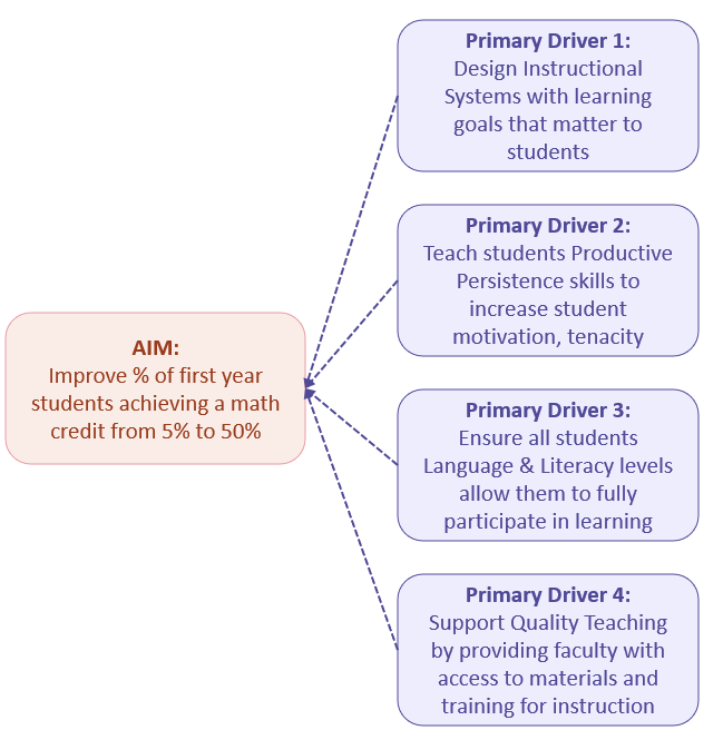
2. Develop the Supporting Primary Drivers
Next, we need to think about the best initial bets to effect the AIM of the proposed improvement, the primary drivers. Think of these as predictions for what the team (you are working as a team, right?) strongly believes will contribute toward realizing the AIM.
Following the example in the book, the authors provide four primary drivers that they bet would contribute toward the aim of boosting the percentage of first year students achieving a math credit from 5% to 50%:
Change the instructional system to incorporate learning goals that actually matter to students’ personal, civic, and work lives;
Support development of “persistence” skills in students to meet math challenges and see them through to solution;
Ensure students literacy levels are sufficient to understand math problems, reason mathematically, and communicate results;
Manage variation in teaching by providing consistent teaching resources and support to lead instruction in the classroom.
NB: observe how the arrows point from the primary driver nodes toward the AIM.
3. Select Secondary Drivers
Once we have agreed-upon “big bets” that are going to achieve our improvement AIM, we can detail the smaller bets or predictions or secondary drivers that will act as “levers” to activate them. The objective here isn’t volume but quality. Select a few secondary drivers that will effect the most productive change in corresponding primary drivers.
Again, following the example in the book, the authors identify five levers that will help to activate the second primary driver, Productive Persistence:
Reduce transitions and assure sustained enrollment across semesters
Deliberate focus on “starting strong”
Promote students’ ties to peers, faculty, and program
Create math that matters with course material students find interesting and intrinsically-motivating
Enhance faculty’s skills and beliefs regarding student engagement and success
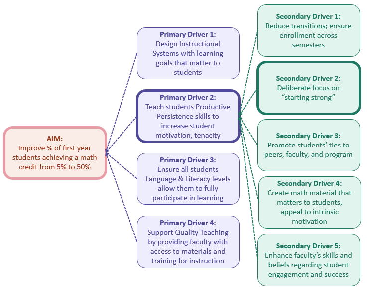
NB: I’ve highlighted the nodes for the second secondary driver and its antecedents in the diagram above to show the linkages back to the AIM. We’ll detail the supporting PDSA experiments next.
4. Create PDSAs to Test Changes for Improvement
Finally, we round out our Driver Diagram with the change experiments we plan to run to test our ideas against reality. These can be new or enhanced processes, tools, materials, or norms that we require to sustain productive change. Critically, this also the engine room for creating new knowledge using PDSA or Plan-Do-Study-Act loops.
Once again, the book’s authors outline six PDSAs that support the secondary driver for ensuring a “strong start”, which in turn is an activating lever for the Productive Persistence primary driver.
Create engaging opening lessons to capture attention and interest early and ensure success
Institute direct interventions with students to keep them engaged
Implement changes in the informational infrastructure to enable improvement efforts and provide timely access to emerging evidence for students at risk of failure
Create activities to establish supportive classroom connections between students, faculty, and program
Develop supportive classroom norms for productive struggle with math
Institute professional development for faculty to promote “strong starts”
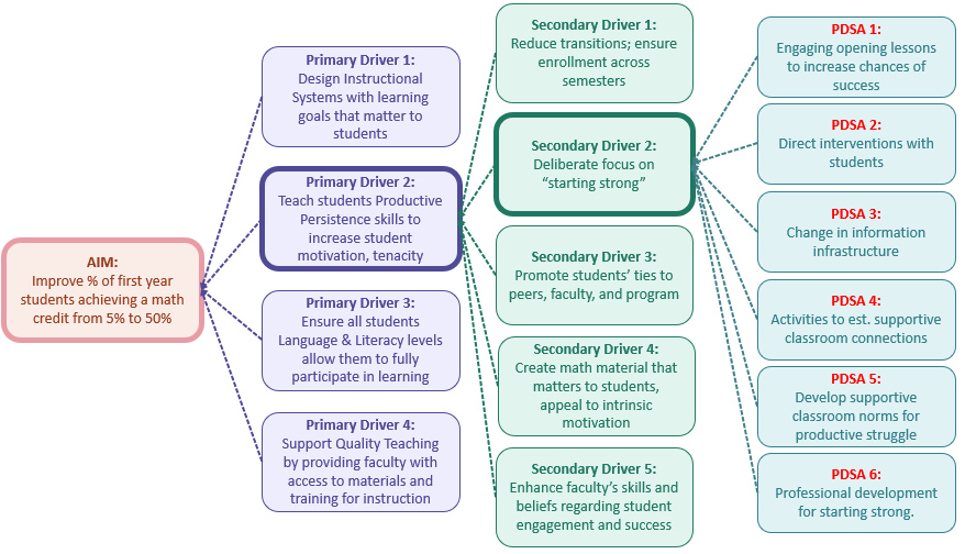
And so we have a relatively simple flow diagram that at-a-glance provides infromation about the improvement theory we’re going to test. I’ve made mine a little fancier than the one in Learning to Improve with color-coding and highlights to make reading and following the flow from PDSA to AIM easier to see and process — anything to relieve cognitive load is good!
Bringing it All Together: Visualizing Your Theory of Improvement
Much like Deming’s Production Viewed as a System, a Driver Diagram organizes and presents the discrete, interrelated components that describe a theory of improvement as a system. In fact, it’s in building the map together with peers that everyone begins to learn about the first domain of Deming’s System of Profound Knowledge: Appreciation for a System. Some benefits it provides:
A map that shows participants how their ideas, interests, and expertise fit into the improvement effort;
A visualization of the complex relationships that comprise an improvement
A means for professionals to find where they can best contribute or help the larger improvement effort
A knowledge artefact that can be referenced for future improvement
A concrete illustration of where individual boundaries of understanding are
A means for tracking which PDSAs are currently in flight
Moreover, as the book authors point out, it is by design, “possibly wrong and definitely incomplete”. As the map is used gaps in understanding, oversights, errors, and new evidence will inevitably surface, and it will become refined as these feedbacks are incorporated.
My preference for building these kinds of diagrams is on large, highly visible walls or whiteboards with post-its (Super-Sticky, thank-you-very-much) because it engages the mind better when writing and arranging the nodes. Of course, you can use tools like Miro to build them virtually, however, you need to have regular sessions where everyone gets together to review it otherwise it can become lost and invisible.
Reflection Questions
Consider the example of how to build a Driver Diagram that we’ve just walked through: how could you design a new improvement with it? What would be the AIM of the change you’d want to make? Who could you involve in detailing the primary and secondary driver nodes? What PDSAs would you try to test your change ideas?
What would make it easy for everyone to participate? What sources of resistance do you predict? How could they be overcome?
As always, drop your thoughts into the comments below and tell me how you prefer to visualize and organize system change work…
Subscriber Exclusive
If you are a paid-tier subscriber, you’ll get first access to a custom tutorial app I put together for learning about the Driver Diagram using the example from Learning to Improve that includes a tool for creating your own: