
PBC Analyzer v1.0.1-Beta
First Official "Release" of My PBC Power Tool

Happy Labour Day! I hope you’re enjoying time off with family and having some fantastic BBQ!
THE AIM for this post is to provide you with the first real “release” of PBC Analyzer v1.0.1-Beta for your exclusive review. Why v.1.0.1? Because I left a bug in 1.0.0 right after I published the release and had to do it all over again!
Some bugs have been squashed, code refactored and optimized, and new features added to this release to support more sophisticated analyses of data sets that make it easier to stratify and plot, along with the ability to use date columns.
DOWNLOAD PBC ANALYZER V1.0-BETA HERE
Installation
If you have already installed Python and the dependent libraries for the last release, it will be a snap: just de-compress the .zip package into a new folder. If not, follow the instructions here.
Running the Demo App
As before, this is done at the command prompt where you have decompressed the files:
python3 pbc-analyzer-adventure.py
This will bring up the familiar demo app with a new data set, Canada: Monthly EI Recipients, so you can run the same analysis I wrote about in my last post:

There are also some new features to support this in the main analysis loop, starting with an associated date column and date format string for selected data sets.

You can find the corresponding column in the updated pbc-sample-data.xlsx file:

Formatting Dates
The date formatting string is from Python - a bit counter-intuitive, but the easiest to use in this instance. Some examples include:
%b-%Y - short month, long year, eg. Jan-2015
%b-%y - short month, short year, eg. Jan-15
%a %b %d, %Y - short day, month, date, and long year, eg. Sun Sept 1, 2024
More examples can be found online, but you can just use the defaults for each in the demo app to get started.
Selecting Data at Regular Intervals
The new —rowInterval feature I discussed in my last post can be experimented with in the app by providing a starting index and interval to select rows. For example to mirror the analysis I did by comparing each June’s EI figures, you could enter 5 12:

To set these options from the command line you would use the following:
—-dateColumn ‘cmei date’ ‘%b-%Y’ —-rowInterval 5 12
This will generate my now-famous PBC that we saw in my last post:

Using Dates with Custom Data
Suppose you want to test out your own time-series data in the custom columns: here’s how you could do that:

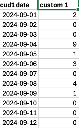
Note that “cud1 date” corresponds to the date field for the “custom 1” column in the data file. My data has dates formatted as yyyy-mm-dd, but I’ll be reformatting that as “mmm dd yyyy” with the format string “%b %d %Y”:
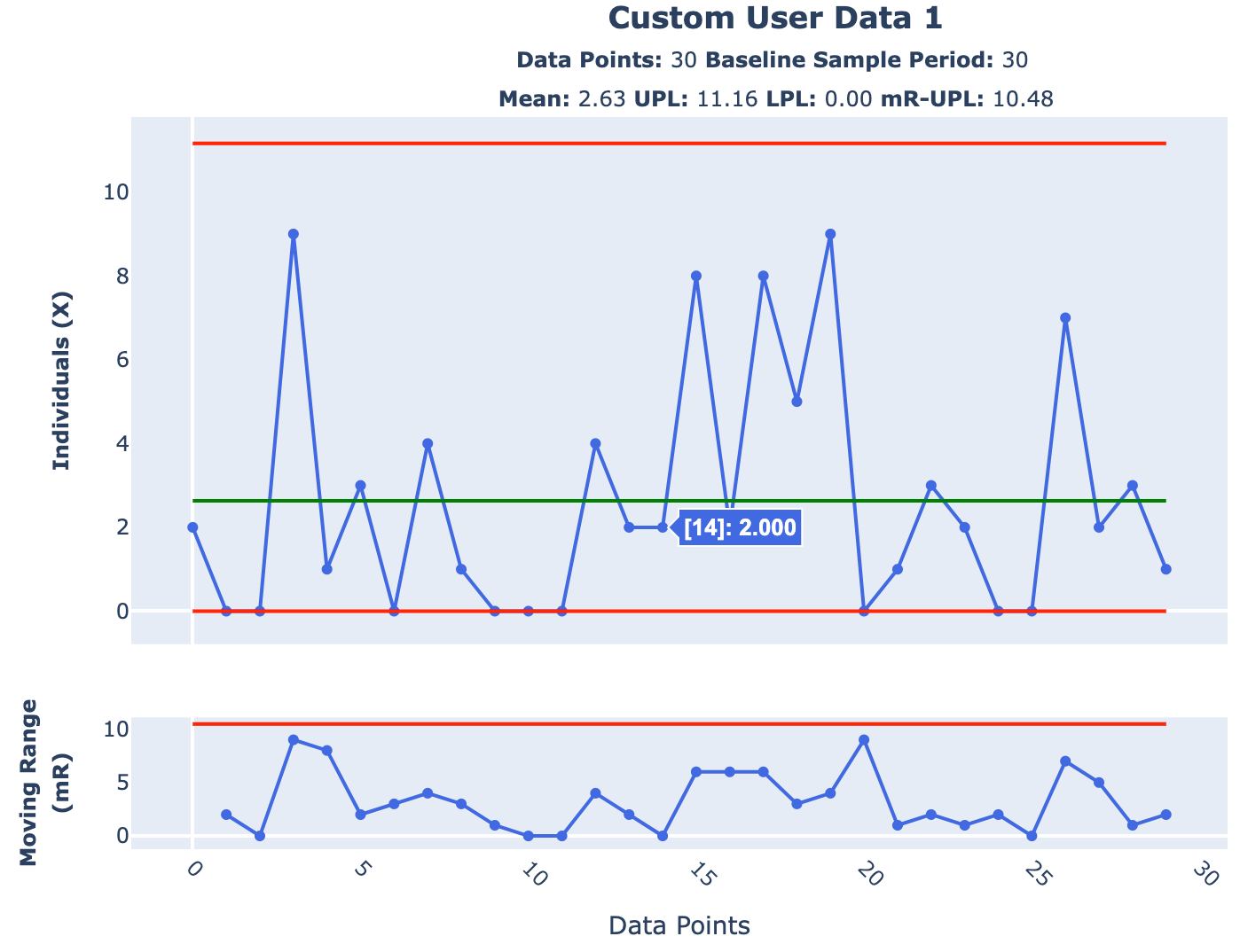
Launch the chart and you get a perfect PBC of 30d worth of data in my case:

Of course, if you just want the classic 0-based indexes, just type “none” for the date column on the next analysis and you will be set:

NB: Once you exit back to the main menu, your custom configurations will be reset.
Upcoming Feature Sneak-Peek: Shifting the Limits
A key feature I wanted PBC Analyzer to have was the ability teach users how to implement a more advanced technique on their plots called “shifting the limits”. We do this when we want to break our PBC down into contiguous segments, each with their own mean and process limits, that “follow” the variation in the data to see what patterns are revealed.
In the short vid below you can see this new feature in action on the Team Alpha and Team Beta Daily WIP Level data sets as I step through adding two “shift points” to break a single XmR chart into three parts over successive plots. NB: Observe how both the X and mR charts change as each limit is “shifted”:
We usually shift the limits when we suspect something significant has occurred in the underlying system or process that has transitioned it from one period of stability to another and want to see this in-context. In the case of the two dev teams, shifting the limits allows us to see how Team Alpha’s and Team Beta’s respective systems handle workload.
Finding where to make the break is a bit of an art and requires some patient trial-and-error to get right even with the a good Excel template and formulas. Now, with the —-shiftPoints option I’ve added for the next release of PBC Analyzer, this powerful technique becomes more accessible, allowing for more rapid feedback and analysis. What used to take me 10-15 mins can now be done in 10-15s.
For example, all you need to provide is the indexes for where you want to shift the limits, eg. for Team Beta I used —-shiftPoints 14 30 and for Team Alpha —shiftPoints 11 26 when running from the command prompt. Of course, you’ll also be able to do this in the next version of the demo app.
And of course, you can export your shifted plots back into Excel so you can inspect the data for yourself and validate your learning:

Expect to see this update in a future release.
Questions, Comments, Feedback?
As always, you’re the first to see my work and I really appreciate the feedback that’s been provided to-date. Drop me a line either by Direct Message or through the comments below which will be open to paid-tier subscribers only. Let me know what you think of the latest release, how it has worked on your own data, and where it worked well or didn’t, and what you’d like to see in the future.
