A phenomenon will be said to be controlled when, through the use of past experience, we can predict, at least within limits, how the phenomenon may be expected to behave in the future.
- Dr. Walter Shewhart, Creator of the Control Chart
[T]he control chart is not ultimately concerned with probabilities, or questions concerning which probability model best fits the data. It is instead concerned with helping people understand when they can make predictions concerning future observations, and when they cannot safely do so.
- Dr. Donald Wheeler, Understanding Statistical Process Control, 2nd Ed. (p. 38)
THE AIM for today’s post is a general announcement that I’ve been teasing for a while with screen cap videos since September: late yesterday afternoon I “pushed” the final revisions for my new app, PBC Analyzer PRO, into production and it officially went LIVE.
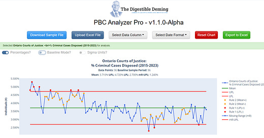
It looks a little different than you may remember, but it is essentially the same UI but with more refinements inside to improve performance:
It is currently available only for paid-tier subscribers as a benefit, however, I will be releasing a free version that will allow you to try it out on a fixed data set to see if it’s something you’d like to support with an upgrade to your membership.
Aim
As mentioned here previously, the aim for creating this tool was to create an interactive educational experience that teaches users how to analyze data differently while they use it, and in this respect I think I’m over the target, but there’s still more work to do to port over some features from the console version, and to make it even more user-friendly.
I’m also making good on a commitment I made earlier this year to deliver a better version of my Excel template for creating Process Behaviour Charts, which even with pre-filled-out formulas and ranges, tended to be a technical process that set up a barrier-to-entry for some new learners. With PBC Analyzer PRO, I’m automating the same techniques and processes I used to create these templates and charts so users spend more time learning how to get better insights into their data than into the finer points of Excel.
Personally, I’ve stopped using my templates in favour of the tool because it takes care of the details and lets me get to the fun part: playing with the analysis, looking for signals.
Cool Features
PBC Analyzer has a significant advantage over my trusty templates in how fast it can re-calculate process limits with a couple of mouse clicks. Being able to shift limits by clicking a data point, or dragging a selection box around a range of points, was a design goal for me, and one that I get a lot of enjoyment out of using on different data sets.
Next Steps and Back to Work
This app has literally consumed almost all of my available time over the past two months, so I really need to get back to “regularly scheduled programming” around here with some new articles and Miro board walkthroughs. I also want to return to the podcasts I started earlier this year - hopefully one or two can come out before Christmas!
In the immediate term I’ll be working on the “free trial” feature so more of you can play with the app, and also to get in front of customers everywhere, in particular educators and coaches who might find this useful in teaching a unit about variation and data analysis. I’m also tempted to get it in front of journalists who keep hyping two-data-point-comparisons, but that may be a bridge too far, for now.


