
How to Build a Deming Leadership Assessment Survey
Visualizing the Relationship Between Management Practices and Symptoms

THE AIM for this post is to walk you through how to design a survey to aid leaders and managers who are new to Dr. Deming’s theory develop an understanding of how their managment practices are connected to common symptoms or behaviours they are observing. We’ll next augment the impact of the survey results by presenting them as a Sankey diagram using an online tool, Sankeymatic, to make the connections between practice and symptoms more apparent.
Based on the nine Faulty Practices of management that Deming describes in The New Economics, the results of this exercise can be used to open up a dialog on transforming management, establish a baseline for future improvements, preparation for a workshop, or all of the above.
Let’s begin with the survey design.
The Survey
I began this project by designing a two-part survey that leadership/management respondents would answer using a standard 5-point Likert scale as a self awareness assessment, eg. 1: Not at all, 2: Slightly, 3: Moderately, 4: Quite a bit, 5: To a great extent.
Part 1 is concerned with surfacing symptoms of dysfunction leadership and management are observing in the organization, while Part 2 examines their prevailing theory of management viewed through the lens of the Nine Faulty Practices that Dr. Deming describes in The New Economics.
So, for example, in Part 1 I ask questions like:
I notice that employees fear making mistakes, speaking up in meetings, or challenging decisions.
I have observed a lack of innovation or risk-taking across teams or functions, with a reluctance to experiment or propose new ideas.
I feel that as a leadership team we do not sufficiently invest in continuous education and self-improvement programs in the organization.
I observe that we, as leaders, focus more on holding individuals accountable for performance rather than improving processes that shape their work.
In Part 2 I ask questions like:
Our leadership team reacts to daily challenges in an on-demand fashion rather than through the lens of a consistent management theory or framework.
Our organization relies on performance management of employees using ratings, rankings, rewards, and penalities to motivate leaders, teams, and individuals.
Our organization relies on monetary or promotional incentives to drive outcomes at the leadership or functional level.
Functions, departments, or business units in our organization function independent of one another, with their own priorities and objectives that are set by leadership.
The Map
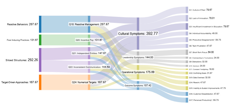
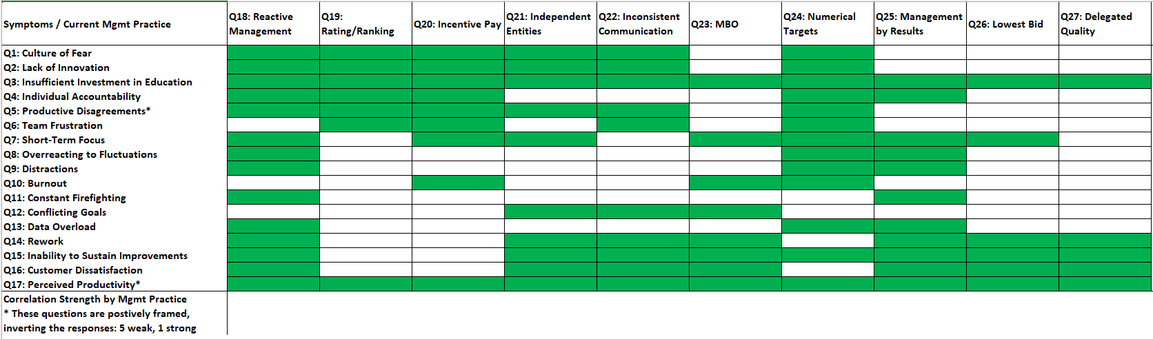
To make the connections between observed behaviours and management practices visible, we need to establish causal connections between them using a matrixed map. This will also help us to do the math and aggregate the responses which we can then turn into a Sankey diagram.
In Excel I created the following matrix with observed symptoms on the left, and corresponding faulty practices along the top, and color-coded cells where I thought there were reliable intersections betweeen them.
NB: This can be tailored according to the questions asked. Also, for this exercise, I’ve expanded Dr. Deming’s nine faulty practices to ten.
I then created two feeder tables on separate worksheets to hold simulated survey results for Part 1 and Part 2 for a dozen leadership respondents:
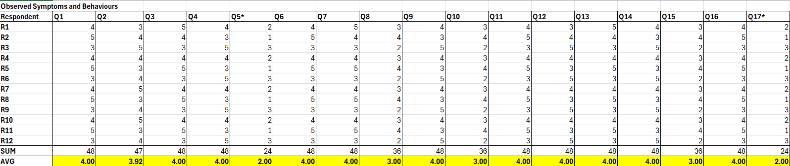
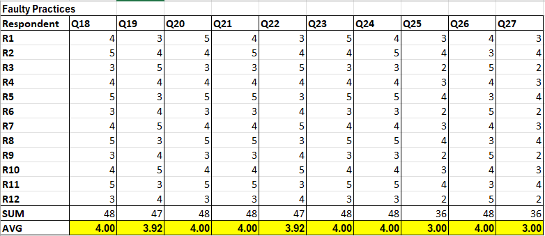
Note how this simulated leadership team is putting out an average of 4.00 for every question, indicating a lean toward confirming that they are seeing the symptoms and indulging in the faulty practices “quite a bit”. In real life, this may swing in wildly different directions as leaders and managers over-and-under estimate reality.
Scoring the Map for Presenting in a Sankey Diagram
The aim for presenting the survey data in a Sankey diagram is to communicate the strength of a relationship between a practice and symptom through the relative thinkness of the “ribbon” that connects them: the thicker the ribbon, the more significant the correlation.
In order to do this, we need to assign a “weight” to each correlation which we can easily do by multiplying the corresponding average symptom score with the average practice score. So, for example, if we want to know the correlation strength between Q1: Observing fear in employees (avg. score: 4) with Q18: Reactive Management Practices (avg. score: 4), we’d multiply the two together for a combined correlation strength of 16.
Keep reading with a 7-day free trial
Subscribe to The Digestible Deming to keep reading this post and get 7 days of free access to the full post archives.