A Systems View of Variation and Quality
Visualizing the Relationship Between the Process and the Result


THE AIM for this post is to share some visualizations I’ve been working on for teaching the basics of the Taguchi Loss Function to managers and leadership who are new to the material. My plan is to get these into a more polished state so readers can use them in their own workshops and seminars without having to do all the work up-front.
Recap
In a popular newsletter from October 2021, I wrote a high-level review of the Taguchi Loss Function, comparing it to a traditional in-spec/out-of-spec step function, and how the canonical curve Taguchi suggested in his 1960 paper is more aligned with what happens in reality.

Some may recall the diagram below from that newsletter:

Basic use case for the curve is in how it correlates a process’ capability with the approach toward or departure away from an ideal target, which defines a “loss” which is more aligned with real-world experience than a step-function with arbitrary specification limits. It also marries up well with an understanding of how a process varies, creating a distribution of results over time.
In this diagram, I’ve overlaid a normal distribution curve with the average aligned over the target:

When a process is so-aligned, we have a profoundly different view of quality: not conformance to specifications, which can be beyond the capabilities of the process, but on target with minimum variance. Well, almost: there still a lot of variation in this distribution. Ideally, that curve needs to tighten up to the mean.
Per Dr. Wheeler in his text Understanding Statistical Process Control:
“On Target” will require that one know the Process Average, and sets the Process Aim in such a way to get the Process Average as close to the Target as possible…
(p. 146)
Thus, we have in one diagram an example of how variation and quality are correlated. But, I think we can be more impactful when we can show how the curve works in practice with some animation.
Four Scenarios
In the following video, I’ve strung together four slides with animations to elaborate on these diagrams and make it a little clearer how the curve works at a high level when under/over shooting a target, and mis/ideally-aiming the process average over the target.
Click the video below to see the animations, and read below for descriptions of each.
NB: These are ideal curves and distributions for illustration purposes. In real-world applications, curves and distributions can and will have different distributions and variation in the frequency of results.
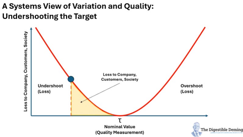
In the first slide we see the effect of under-shooting the target, producing a large area under the curve that defines the loss, both in terms of value, but also in intangibles to employees, the company, its customers, and society. Yes, society! Whatever we fail to make to a suitable level of quality means we let down customers and by extension society!
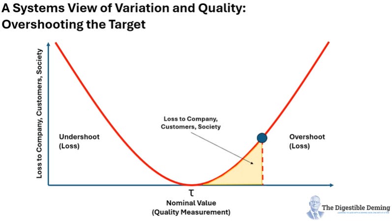
In the second slide, we see the effect of over-shooting the target of our process with the same effect of creating loss, albeit smaller than when the process fell short:
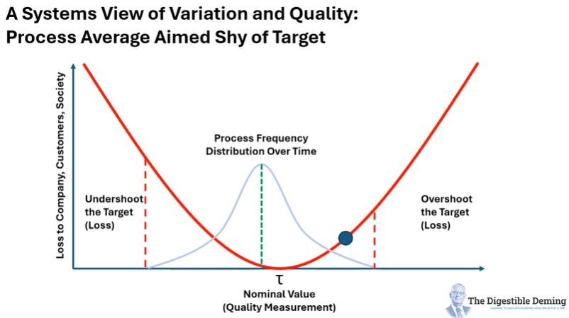
In the third slide, I show the distribution of results of a process overlaid on top of the curve, with the average mis-aimed just shy of the target, demonstrating a process that while in statistical control, isn’t hitting the mark just yet. More work to do to move that average to the right…
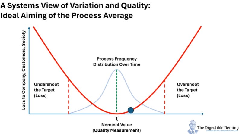
In the final slide I show what that might look like with a process average aligned over the target:
Applications
Taguchi Loss Curves found their initial value in optimizing manufacturing processes, however, the theory can extend to other applications wherever there is a process that needs to hit an ideal target with a caveat: the aim is to minimize loss, not optimize for it. For example, in Dr. Deming’s Red Bead Experiment, one of the rules we put in place early on to motivate workers to produce fewer defects is to set a target of three or less red beads per lot of 50. If our aim is to improve quality, we wouldn’t optimize our process to aim the average at 3 red beads but as close to zero as possible.
With this in mind, here are some examples of applications for thinking about quality as a continuum rather than an in-spec/out-of-spec step function:
On-Time Arrivals for Public Transit (asymmetrical curve, skewed right): One near and dear to my heart here in Toronto where this is an elusive zephyr. Undershooting the target might seem preferable, but cumulatively can cause delays especially in rail applications. Continual under/over shooting diminishes passenger confidence and there is a drop in ridership, as is happening here. Curve Shape.
Call Centre Time-to-Resolution (asymmetrical curve, U-shaped): A classic scenario where most call centre managers default to setting a target call length or maximum, rather than time-to-resolve a customer issue. If the call is too short, under 3 mins, there will be high-loss; too long, say over 15 minutes, and there will be high loss as well due to frustration and impatience. There is a “flat bottom” between the two where customers expect their problem to be resolved. Of course, management should be working on the upstream causes of the calls rather than optimizing for the ideal call-length.
Healthcare Wait Times (asymmetrical curve, skewed right): Another near and dear to the Canadian heart where we can wait for months in a queue for surgeries or even standard procedures. The optimal wait time would be less than a week, increasing in loss with each additional week to the right. The losses here are wide ranging, not just in terms of quality of life for the patient, but their family, and if still working for their employer and from there to society. Resolving this problem is a complex problem because it is the outcome of multiple systems interacting with each other, many of which aren’t even aware of the effects they are causing.
In each of these scenarios, the “quality” of the service is communicated to the customer or user by how well it meets the expected time of delivery, with the presumption that all works out well. Of course, this isn’t the case and there are subsequent curves for the journey experience on public transit, the elimination of problems that make it to the call centre, and the speed of recovery from a procedure for a patient.
What Do You Think?
Given what I’ve presented, what applications can you think of where quality is conveyed as a continuum toward or away from a target? What would the shape of the curve be? What does the target define? Is it optimizing for loss, or trying to minimize it?
Would it be useful to have pre-made animations such as I’ve shown above to explain this concept to others?
Let me know in the comments below!