

Mini Case Study: Are Tommy John Surgeries "Surging" in Baseball?
Mini Case Study: Are Tommy John Surgeries "Surging" in Baseball?
Mark Graban Applies Knowledge of Variation to Uncover Latent Signals in Data to Track Down Causes


THE AIM for today’s newsletter is to share with you a blog by my friend and colleague, Mark Graban, on an interesting process behaviour chart (PBC) analysis he did on the frequency of “Tommy John” surgeries in the Major and Minor leagues, specifically to understand whether there has been an uncharacteristic “surge” in 2024 as reported in the press. I urge you to read it, it’s really fine work that I’ve based this newsletter on.
In this mini-case study, Mark draws upon his knowledge of baseball, Deming and Shewhart’s theory of variation, and the data analysis techniques developed by Dr. Donald Wheeler to uncover latent insights within the data to determine whether this hypothesis held water, and makes a surprising discovery that confirms most commentators are looking in the wrong places for answers.
NB: Mark taught me the techniques he uses here some years ago, and I continue to use them to this day. He has a book, Measures of Success, that can teach you as well.
What is a “Tommy John” Surgery?
Before diving in, let’s first get an operational (ha!) definition for a “Tommy John” surgery. This is the colloquial name for an ulnar collateral ligament reconstruction which repairs the ligament inside the elbow that helps to secure the elbow joint. The aim is to stabilize the elbow, alleviate pain, and restore range of motion.
Athletes, such as baseball pitchers, are particularly-prone to tearing their UCL requiring this surgery, which was first performed on LA Dodgers pitcher Tommy John in 1974 by orthopaedic surgeon, Frank Jobe, who was also the Dodgers’ team physician.
Big, Vague Concerns
Mark, a huge baseball fan, had his curiosity piqued by headlines he was reading in the sports press about an apparent surge in Tommy John surgeries and the probably causes behind them:
MLB Pitching Injuries in 2024: Key culprits in baseball’s elbow epidemic
Why are MLB pitching injuries on the rise? Four possible causes from pitch clock to changes at amateur level
Clayton Kershaw doesn’t have answers for spate of MLB pitching injuries: ‘Nobody knows’
As he learned from his time studying under Toyota-trained problem-solving coaches, these statements are signals of undefined problems, or what they called “big vague concerns”. Before considering them seriously, properly-analyzed data would be required to determine if there really is a problem worth taking action on, in this case whether there really is an “epidemic” of baseball-elbow.
Start with a Theory: It’s all Common-Cause Variation
In The New Economics Dr. Deming explains his view on how we learn as a “theory of knowledge” which begins by making a prediction (theory) about something and then repeatedly testing it against reality. Whether or not our prediction holds through each round, we gain knowledge we did not have before. If our prediction fails, we need to either revise or abandon our theory and try again.
Mark began with a hypothesis that the reported “surge” of Tommy John surgeries is confounding a signal of special causes with routine, common-cause noise. This is one of two mistakes managers make in reaction to variation in a system, the other being the inverse when real signals are disregarded as “just noise”. He now needed a way to test this theory.
Understanding Variation: Wheeler’s Axioms
Long-time subscribers will recall the name of Dr. Donald Wheeler who I have often referred to in my newsletters on process behaviour charts (PBC). A statistician, he is a colleague and contemporary of Dr. Deming’s who has made significant contributions to advancing the statistical theory of Shewhart and Deming, publishing multiple books on the topic, including one that should be on your desk at all times: Understanding Variation. Mark has been fortunate enough to take classes from Dr. Wheeler on how to analyze data with PBCs that formed the basis of his book, Measures of Success that I mentioned above.
Wheeler provides three axioms in his book disguised as chapter titles that underpin any analysis of data:
Data are random and miscellaneous
Knowledge is orderly and cumulative
The purpose of analysis is insight
Wheeler also provides us with two guiding principles for understanding data in his book that are distillations of Shewhart’s Rules for the Presentation of Data:
No data have meaning apart from their context
While every data set contains noise, some data sets contain signals. Therefore, before you can detect a signal within any given data set, you must first filter out the noise.
In sum, these are the raisons d’être for using process behaviour charts for analyzing data which Mark puts into motion with his analysis, providing the basis for generating knowledge and insights.
Data are Random and Miscellaneous
Dr. Wheeler teaches us that simple comparisons of two values cannot be conclusive because they cannot tell us anything about the behaviour of the values over time. Nonetheless, this “two-data point comparison theatre” is what passes for erudition in the popular press, with the current day’s figures compared to another a day, week, month, or year ago.
Mark found an article that proposed “There is no Tommy John surge this spring (It’s always this bad)”, ie. it’s common-cause variation all the way down, and had supporting data that looked at Major “Pro” League players and their Minor League counterparts:
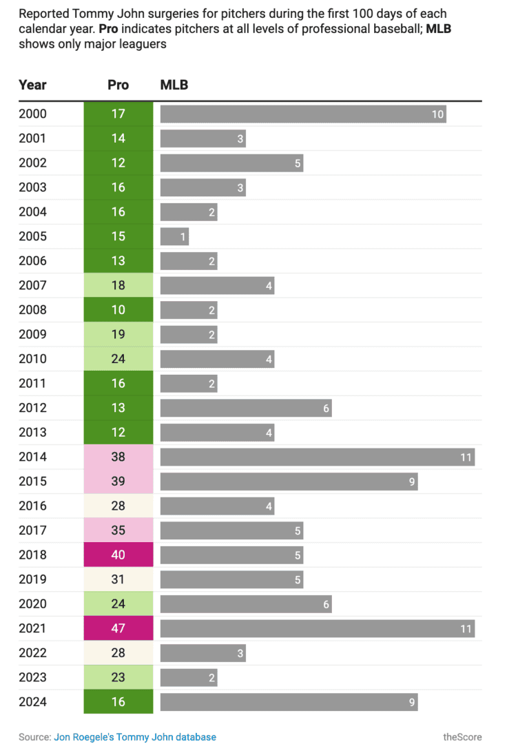
As Mark points out in his article, while it’s good to have data, this isn’t presented in a way that can help us sort signals from noise. It’s also laid out in a way that makes it difficult to separate Major League players from Minor League players. Hint: The color-coded boxes are “Pro” (Majors + Minors), while the grey bars are just Majors. The difference between them is the Minors. Clear? Yeah, me too.
Accordingly, Mark first set about disentangling the data and plotting them as two time-series on a single chart, immediately clarifying the data and making it easier to understand.
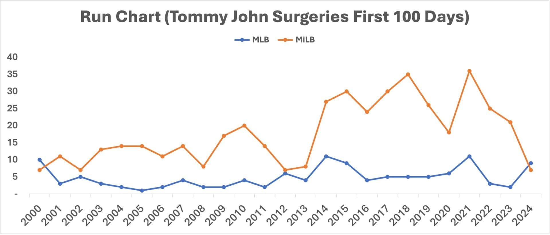
From this, it seems there are way more TJ surgeries in the Minor Leagues compared to the Majors, and there is definitely an upswing in 2024. But is it significant or just noise? That’s where the PBC analysis comes in.
Knowledge is Orderly and Cumulative
Dr. Wheeler teaches us that prediction requires knowledge, while explanations do not. Making sense of random, miscellaneous data is a process where we transform it and interpret it, building an accumulation of new knowledge along the way. The assertion of the article’s author that Mark based his hypothesis on is that the upswing we see in 2024 Major League player surgeries is “routine”, which could entirely be the case based on his experience, but how would he explain this? What is his theory? By what method?
Process Behaviour Charts provide us with a robust method of filtering signals out of noisy data. It accomplishes this with two specially-calculated lines called process limits that help establish the homogeneity or similarity of the data points based on the variation in the data itself.
Mark separated the Major and Minor League surgery data and created PBCs for each. Here’s what he created for MLB TJ surgeries to test the hypothesis that the current upswing is just common-cause noise. At first glance, this could be right conclusion to draw from the data:

PBCs are analyzed for “signals” according to three rules:
Are any data points outside either of the process limit lines (red)?
Are eight (8) or more data points above or below the mean line (green)?
Are 3 of 4 consecutive data points closer to a process limit (red) than the mean (green)?
Doing a quick scan, we can see that the threshold for Rule 1 hasn’t been met: all the data points are between the process limits, which confirms the hypothesis that Major League TJ surgeries are uniformly awful. Nothing to see here.
However, on closer inspection there are nine data points from 2003-2011 that indicate a Rule 2 signal, which Mark highlights in the following chart:
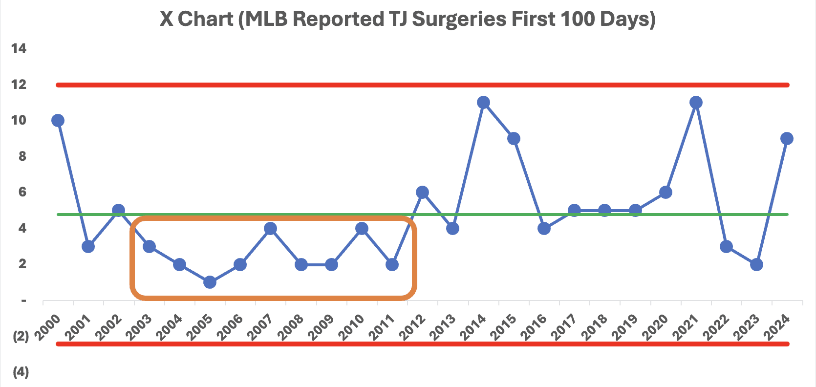
Based on his knowledge of PBCs and variation, Mark used his judgment to evolve his hypothesis that something changed in 2012 that increased the number of surgeries. He began to test this by re-calculating the limits using the data points from 2001-2011 as a baseline, obtaining this chart:
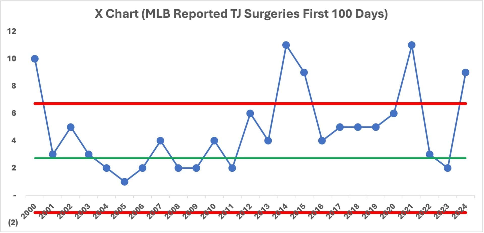
Suddenly, the analysis shifted dramatically with Rule 1 signals in 2014, 2015, 2021, and 2024—we don’t consider 2000 as that is before the baseline period. We also see a Rule 2 signal beginning in 2012 with 11 consecutive data points above the mean. Following the data, he re-computed or “shifted” the limits for 2012-2024 to define this new baseline period:
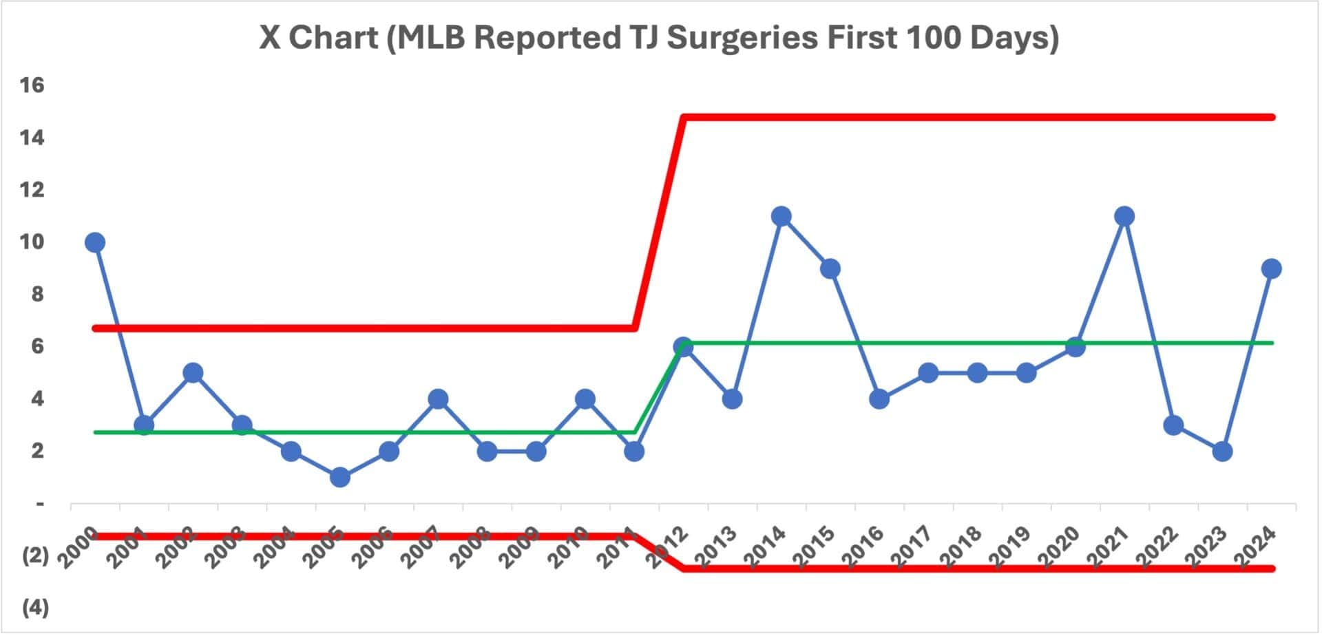
What do you observe? Notice how the process limits are narrow for the baseline period of 2001-2011, but then widen beginning in 2012 and revolve around a higher mean. This tells us that there are two different “systems” at play that were obscured in the original bar chart. Mark now had what he needed to derive some insights from the data.
The Purpose of Analysis is Insight
Dr. Wheeler teaches us that data are usually collected to provide a basis for action, however, unless we know how to separate the signals from noise, the actions we take can be totally inconsistent with what the data actually tells us. Good analysis will provide the basis for asking interesting and important questions about the data under specific conditions. In this particular case, the original action based on spitballing the data may be to do nothing because it’s presumed to be all routine.
In contrast, Mark uncovered these “latent” insights from the data:
Consistent with his original hypothesis, the TJ surgeries for 2024 aren’t a notable outlier, per se;
2024’s TJ surgeries are, however, consistent with a new pattern of random “noise” that began in 2012;
From 2012 onward, the average of TJ surgeries doubled from 2.7 to 6.2;
The subsequent year-to-year variation in TJ surgeries increased.
Why did 2024 swing up? Because, as we learned in my December 13/23 newsletter on Peter Scholtes’ New Competency #2: Understanding Variation, this is the nature of data: when it is high, it tends next to go low, and vice-versa. There’s no need to explain it. It’s far more useful to know when it changes uncharacteristically in relation to its peers.
This said, Mark now had the basis to show that something uncharacteristic changed beginning in 2012, but what?
Putting the Puzzle Together
Mark’s analysis snapped into place when he began to look at articles on what to attribute pitcher injuries toward. One, by an MLB expert reporter, Tom Verducci, suggested it was tied to pitchers pushing themselves to throw fastballs at increasing velocities, which have been steadily, if gradually, moving upward since 2012:
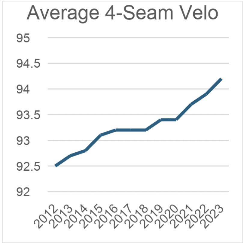
Contrary to the bar-chart analysis that he began to test, Mark now had the goods to conclude that TJ surgeries didn’t increase this year, but have been part of an overall pattern going back to 2012 when pitchers, for multiple reasons, began to chase higher fastball pitching speeds by pushing their UCL beyond the limits it could tolerate.
This was a much deeper and more significant analysis that emerged from application of the good techniques developed by Dr. Wheeler and informed by the theory and methods of Dr. Deming and Dr. Shewhart.
Conclusion & Reflection Questions
In this mini-case study we see how robust methods, backed by good theory can help to move an analysis from spitballing and conjecture on the possible causes of observed phenomena—like a single year’s increase in TJ surgeries—and toward a clearer understanding of the most likely attributable cause, backed by data.
Grounded in the theory of Deming and Shewhart, Mark’s analysis demonstrates how to apply Dr. Wheeler’s three axioms for analysis to transform poorly-presented data using a series of process behaviour charts to glean insights that other methods conceal. This led to his discovery that while current surgeries may indeed be part of a larger, routine pattern dating back to 2012, this also demarcated an upward shift that has a correlation to when pitchers began to chase higher fastball velocities, suggesting a much more effective target for investigating causes and making improvements in how pitchers are trained and coached to prevent UCL injuries.
Consider the analysis that Mark conducted the “big, vague concerns” that motivated it, and the subsequent clarity his analysis of the data provided. What similar scenarios have you observed in how causes are attributed to changes in data? What techniques have been used? How was the data presented to draw these conclusions? Were the actions taken consistent with the data, as Dr. Wheeler would advise? What happened as a result? What was the cost to the system?